Badges of honour: Our favourite city crests
A city’s emblem is its most powerful branding tool.
What would Liverpool be without its Liverbird or the City of London stripped of its dragons?
These abstract logos, emblems and coats-of-arms, end up adoring everything from flags to crests of the local football team. They are a distillation of city in graphic form.
But which ones inspire us most? Which emblems do we want to see grace our T-shirts and mugs? What looks best on a flag?
Here, Umbrella writers talk about their favourite city emblems, and what makes them so special.
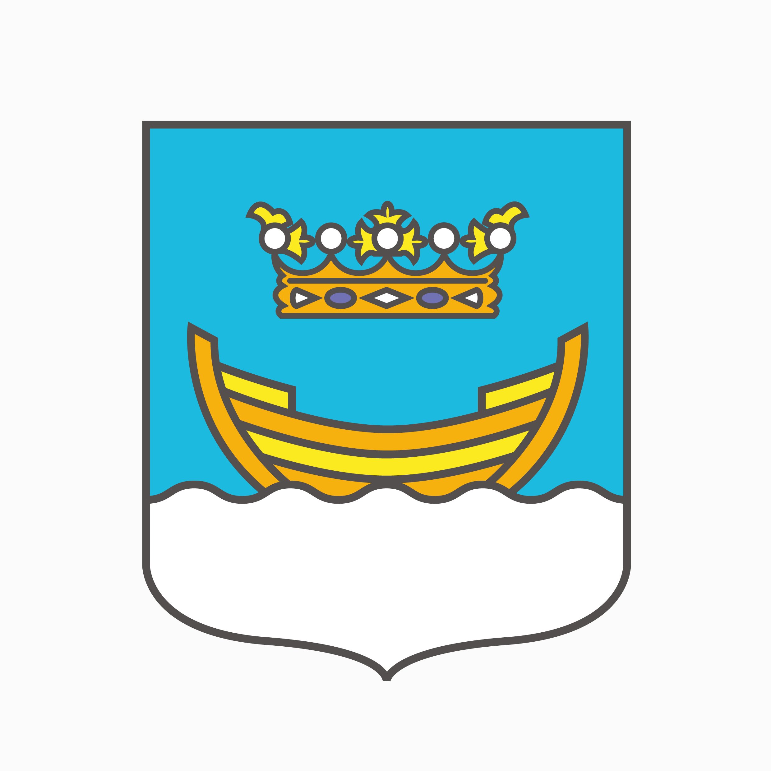
Helsinki
Helsinki’s civic heraldry looks like it should be tattooed on the forearm of a bearded bloke who roasts third-wave coffee for a living. Simple, symmetrical and trendy, it’s clear to see from this bold insignia why Helsinki was crowned World Design Capital of 2012.
The Finnish capital’s coat of arms isn’t cluttered like the country’s garish national arms. Instead, a simple boat, typically gold, but originally red, floats on top of water to indicate Helsinki’s historical role as a seaport and its nickname, ‘The daughter of the Baltic’. The golden crown that hovers above the boat is there to remind us that the city was born by order of Swedish King Gustav I in 1550. The crown is often decorated with red and blue jewels, but we prefer the monochrome version – as do the Nordic hipsters. Probably. Elliott Lewis-George

Bradford
Look at street furniture in Bradford city centre and you’ll notice it all features a wild boar. It all goes back to the 14th Century when (quoting a Victorian reporter), “A ravenous wild boar, of the most enormous size, haunted a certain Cliffe Wood and infested the town.”
The lord of the manor offered a big reward to anyone who could slay the boar, which was eventually killed by a young hunter. The hunter, keen to claim his reward, severed the boar’s tongue (not wanting to take a full carcass to the manor house) as proof of the killing and set about claiming his bounty. However, another young lad found the boar’s body shortly afterwards, and severed its head to present to the lord of the manor himself. He ended up beating the actual boar-slayer and claimed the reward, but the lack of tongue aroused suspicion and the rightful hunter was eventually traced.
So look even closer at Bradford’s boar today and you’ll indeed notice that he’s missing a tongue as folklore dictates. It’s a nice story and, although the council did away with using the city’s crest of arms in favour of some bland corporate logo years ago, the boar is still an instantly recognisable symbol in Bradford and is used all over, from the football club to the bins. And long may it stay that way. Simon Cunningham

Turin
Trust the Italians to have the most handsome, best designed city emblem. Torino, to give Turin its proper Italian name, means ‘little bull’, so it’s no surprise that the city’s logo is an especially beautiful rendering of this most aggressive of beasts. While the bull of Spain is a broody, shadowy figure, Turin’s is rampant and rippled with muscles. No wonder he’s the symbol of the football team that carries the city’s name, though Juventus, whose support comes from all over Italy as well as Turin, also use the bull at the bottom of their crest. And who can blame them? This is one good-looking, extremely fearsome animal. Cross him at your peril. Anthony Teasdale
“While the bull of Spain is a broody, shadowy figure, Turin’s is rampant and rippled with muscles”

Richmond upon Thames
Marked out by its vivid red colour scheme (with a flash of azure for the griffins’ beaks and the upright oars), the crest of Richmond (not to be confused with the one in Yorkshire) is supposedly rich in local symbolism: the rose and portcullis badge harks back to Henry VII; the swan is a nod to the river; while the oars refer to the end point of the annual boat race.
But there is another possible interpretation: the griffins have upended a load of rowing berks on their morning race, the oars are dipped in their blue blood and the discarded hats are all that remain of the hapless crew. The swan, meanwhile, is symbolically dicking about on top of a castle, having reclaimed his place at the top of the watery pecking order. The stuff wrapped around his neck isn’t a rose but fishing tackle, a poignant comment on environmental destruction – like Michael Jackson’s Earth Song video, but less uncomfortable with hindsight. Justin Quirk

Antwerp
It’s no surprise that the most style-conscious city in the Low Countries uses a bold symbol as its logo (though it’s not the official coat of arms). Found on everything from door knockers to the label of the local brew (De Koninck), the hand of Antwerp is a bold statement: strong, unfussy, abstract. Legend has it that the hand is that of a giant, whose paw was chopped off after doing the same to one-too-many travellers visiting the city. While this may be – alright, is – obvious medieval nonsense, it’s left Antwerp with a killer logo, and one that looks great on both beer glass and T-shirt alike. Give it a big hand. Anthony Teasdale

Glasgow
Glasgow’s coat of arms is comprised of four elements, each representing some frankly made-up sounding feats performed by city founder Saint Mungo.
First off, there’s the bird, which represents a robin that St. Mungo “magically brought back to life” after accidentally killing it. Sure. Symbolising another dubious cosmic feat, the tree represents a branch that Mungo turned to flames after it had frozen solid – sort of like a proto-Derren Brown.
The salmons with rings in their mouths represent another unlikely yarn about how the queen threw her wedding ring into the river after a bust-up with the king and only got it back after St. Mungo (who else!) sent a monk to catch a fish and it just happened to be the one that had swallowed the ring. You get the idea.
The bell (inscribed with the words “Let Glasgow flourish”) represents the bell that was cast in honour of a certain local hero intended to be “tolled throughout the city so that the citizens would pray for his soul”. I’d like to imagine that hero was Robbie Coltrane, but I suspect not. Matthew Reynolds
“The tree represents a branch that Mungo turned to flames after it had frozen solid – sort of like a proto-Derren Brown”

Rome
Legend has it that Rome was founded in 753 BC after a fight between brothers Romulus and Remus, sons of the god Mars. The squabble was over where their new city should be located and ended with Romulus murdering his brother, establishing the city on his preferred location of the Palatine hill and naming the place after himself.
For centuries the symbol of Rome has been a bronze statue, the Capitoline Wolf, of the pair suckling on a she-wolf on the banks of the Tiber river, where they’d been left to die as newborns before being saved and raised by a shepherd couple. It had been thought that the statue was Etruscan metalwork from the fifth Century BC, but carbon dating has confirmed it’s medieval, probably from the 13th Century. The finding irritated both local politicians and the curators of Capitoline Museum, who only recently – and reluctantly – officially acknowledged the truth. Our version comes from the badge of AS Roma, with the twins mysteriously removed. Terry Daley

Madrid
You’ll see it everywhere in Madrid: from the football shirt of Atlético to manhole covers. It’s a bear, reaching into a tree to get at some strawberries. The bear has long been the emblem of the city and its earliest recorded appearance was at the battle of Las Navas de Tolosa in 1212, when Madrid troops fought with Alfonso VIII against Moorish rule.
Some years later Madrid councillors were in dispute with local clergymen over the rights to local resources. The king – perhaps not forgetting the support of the city – ceded the fields to the church but granted the forests to the council. The council celebrated their newly acquired rights by modifying the city emblem: the ‘Madrid’ bear is now enjoying the fruits of the forest, standing tall to proclaim his possession of the trees.
The city shield is also framed by seven stars – the brightest ones of the constellation Ursa Major AKA ‘The Great Bear’. The most famous example of El oso y el madrono (The bear and the strawberry tree) is the 20-tonne statute in the main square, Puerto del Sol. The Madrono tree is not a strawberry tree, nor is its name the source of the city’s name. And no-one knows the real reason for either; which sounds very Spanish indeed. John Mackin

Amsterdam
Sometimes the best city crests are the most abstract. The Dutch capital’s is one such example. Its most noticeable element is the trio of St Andrew’s crosses placed vertically on a heraldic shield, said to be a relic of the ancient Persijn family – Jan Persijn was in charge of the city of Amstelledamme (Amsterdam) from 1280 to 1282. Explanations for the meaning of the crosses are somewhat vague, though there are allusions to plague, flood and fire. The usual scene.
What the crosses mean isn’t that important. The thing here is the powerful message that’s conveyed purely through the simplistic design and striking, red, black and white colour scheme. Throughout the city, you’ll see the crest everywhere, and never does it look better than used as a banner by the fans of Ajax FC. The city and football club as one, exactly as it should be. Anthony Teasdale
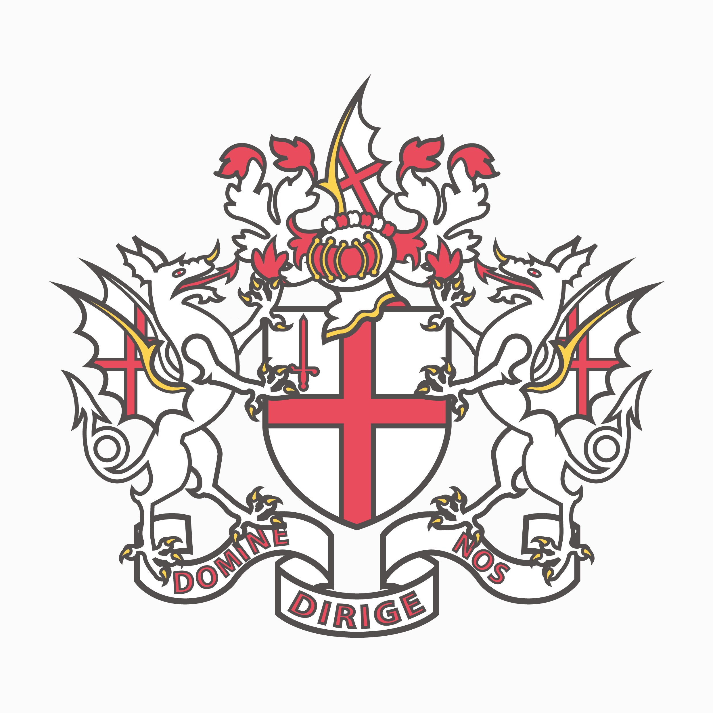
City of London
The City of London’s logo may look like something off an EDL hoodie, but it’s deeply symbolic of the city’s heritage. That cross belongs to St George, a Greek/Italian geezer who currently enjoys patronage in 18 countries other than England, and 25 cities apart from London – itself home to 270 different nationalities, including thousands of refugees.
The shield it’s housed in fittingly represents protection, while the red sword is the bloodied blade which slayed St Paul, London’s patron saint. Saul the Jew, to give him his original cockney-moniker, hailed from modern-day Turkey, and was a persecutor of Christians until his road-to-Damascus epiphany. The City’s famous cathedral bearing his name celebrates this, and is itself famous for its dome – a design nicked from Islamic architecture.
Finally there are the dragons. These winged creatures traditionally symbolise the ability to see the bigger picture (Londoners had to wait for The Shard to get a dragon’s-eye view of the City) and the motto below, which translates as ‘Lord Guide Us’, supports this. Why two fire-breathers? Perhaps because fire both destroys and creates. Apt, then, for a city that burns as brightly, and as often, as wonderful London. Nick Soldinger
“The City of London’s logo may look like something off an EDL hoodie, but it’s deeply symbolic of the city’s heritage”
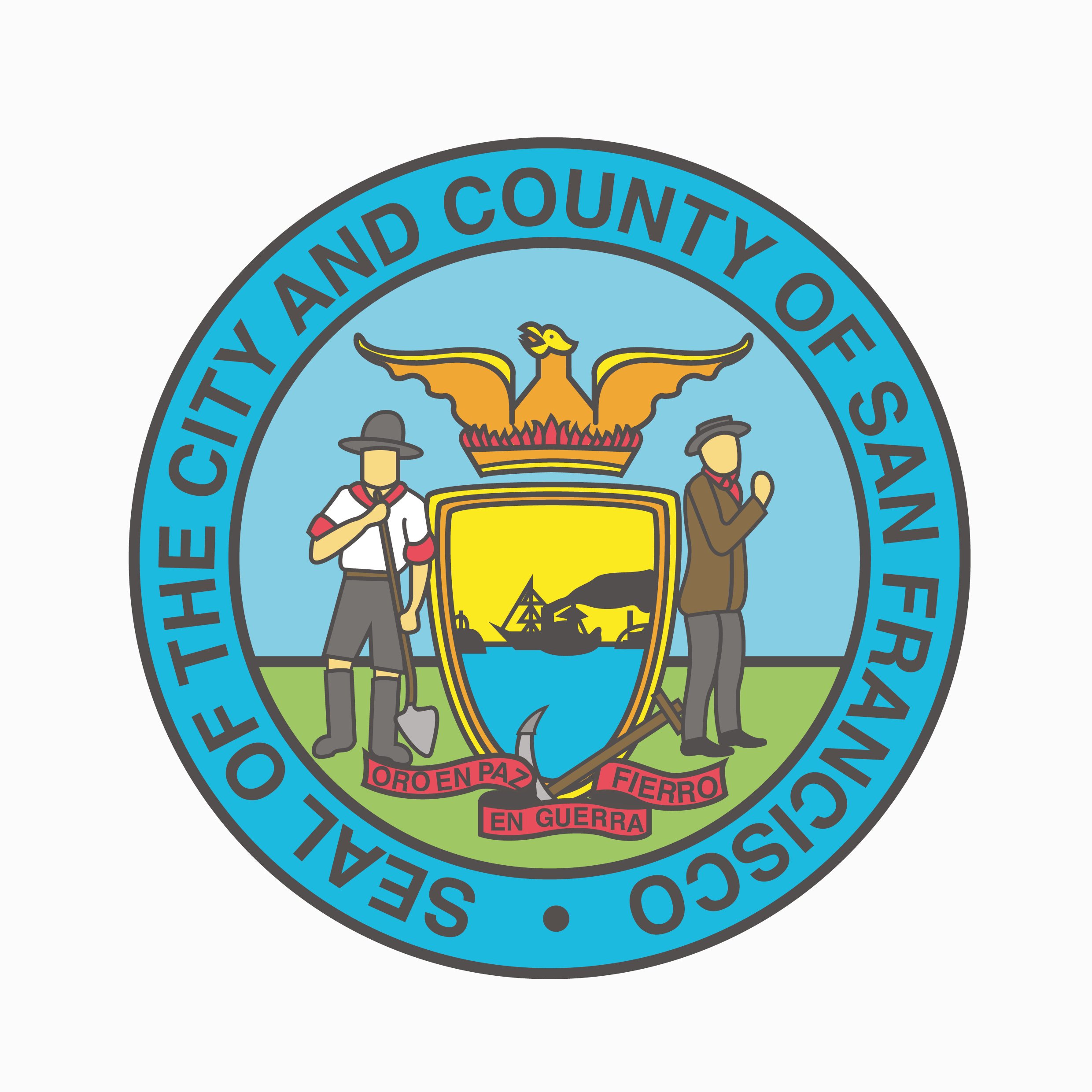
San Francisco
For a city famous for embracing the counter-culture so emphatically, the emblem of San Francisco is surprisingly utilitarian. I’d expected something like a Grateful Dead album cover with the motto, ‘Do you feel lucky, punk?’. What we get is much more prosaic: a miner and a sailor flank a shield showing a steamship entering the Golden Gate. This is crowned with a phoenix rising from the flames.
The phoenix is wrongly thought to reference the city’s rebirth after the catastrophic earthquake and fire of 1906. This emblem, however, predates that event by half a century. Instead it refers to the tumultuous events of the mid-1900s when San Francisco grew from a village of 200 to a city of tens of thousands following the Gold Rush. The new city was forged out of almost nothing by countless immigrants arriving by sea through the Golden Gate to make their fortune prospecting in the hills. The emblem is completed by a motto that emphasises this: Oro in paz, fierro en guerra (‘gold in peace, fire in war’). The use of Spanish (not Latin) serves to remind us that this city (as indeed was California) was Spanish- and Mexican-ruled until 1848. John Mackin
Illustrations by Oliver Heald