Berlin Typography Project: Signs of interest
Signs can tell us a lot about a city.
Picture the brash neons of Las Vegas, or the extravagant Art Nouveau entrances of the Paris Metro – both seem to channel the energy of their respective cities, capturing their character and telling us something about their histories.
And if there’s one city that’s not short on history, it’s Berlin.

“Picture the brash neons of Las Vegas, or the extravagant Art Nouveau entrances of the Paris Metro – both seem to channel the energy of their respective cities, capturing their character and telling us something about their histories”
Over the past few years designer and lecturer Jesse Simon has been documenting the signs and typefaces of Germany’s capital.
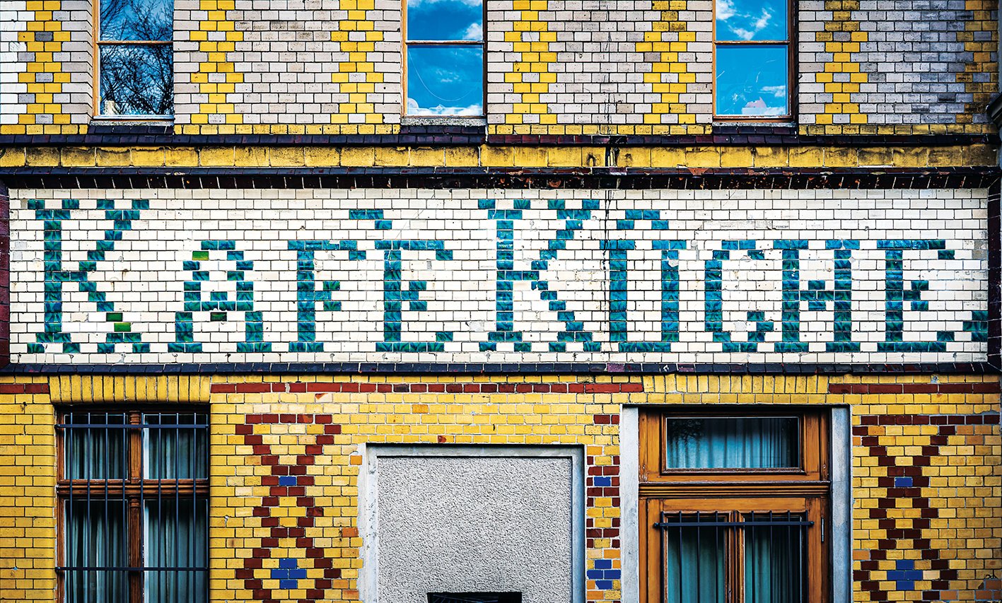
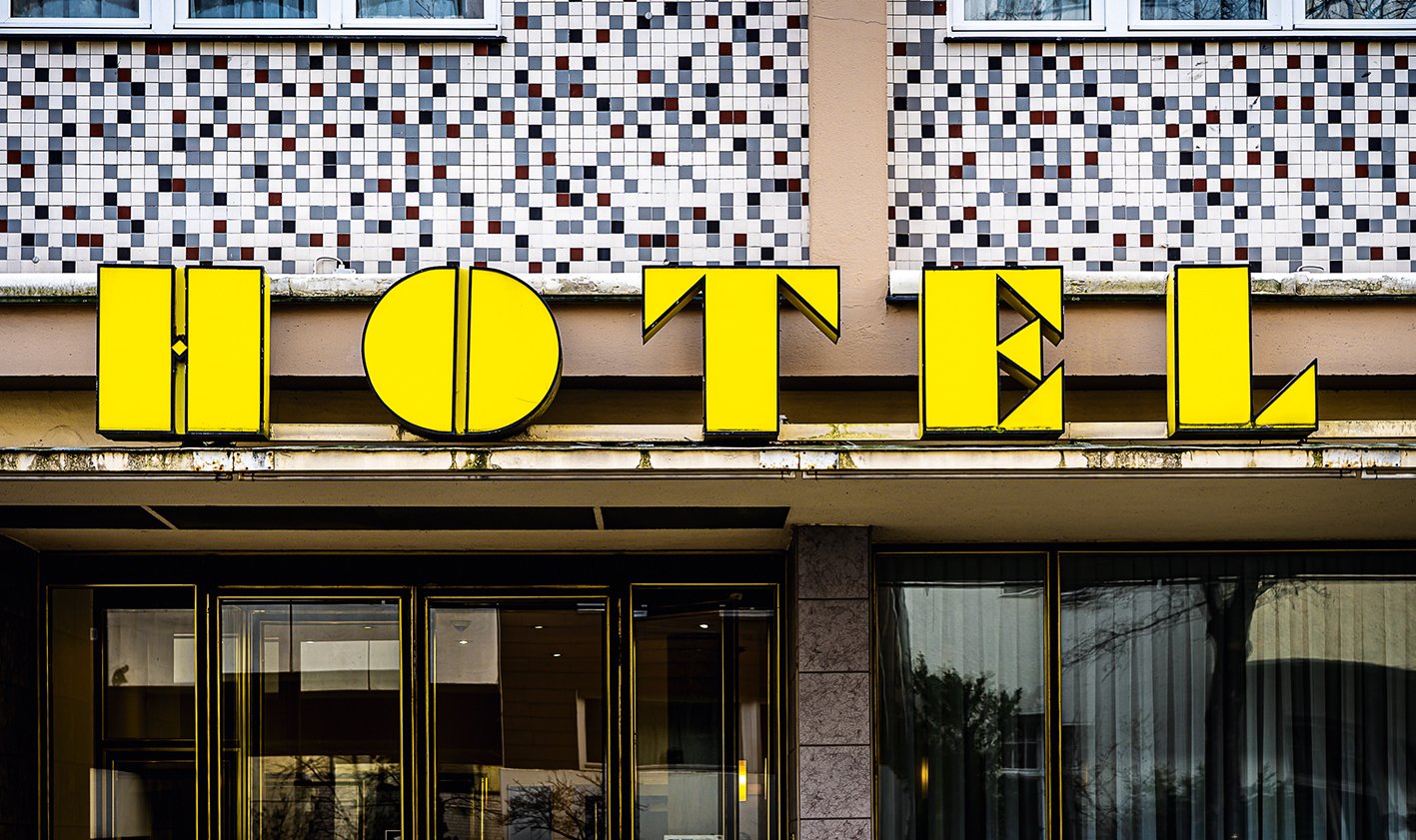
His Berlin Typography Project website documents everything that catches his eye: Weimar Republic-era hotels sit alongside solemn neoclassical stone carvings; mind-boggling modern neon creations placed next to functional-yet-beautiful transport signage from the communist era. It’s a brilliant snapshot of one of Europe’s most fascinating cities.
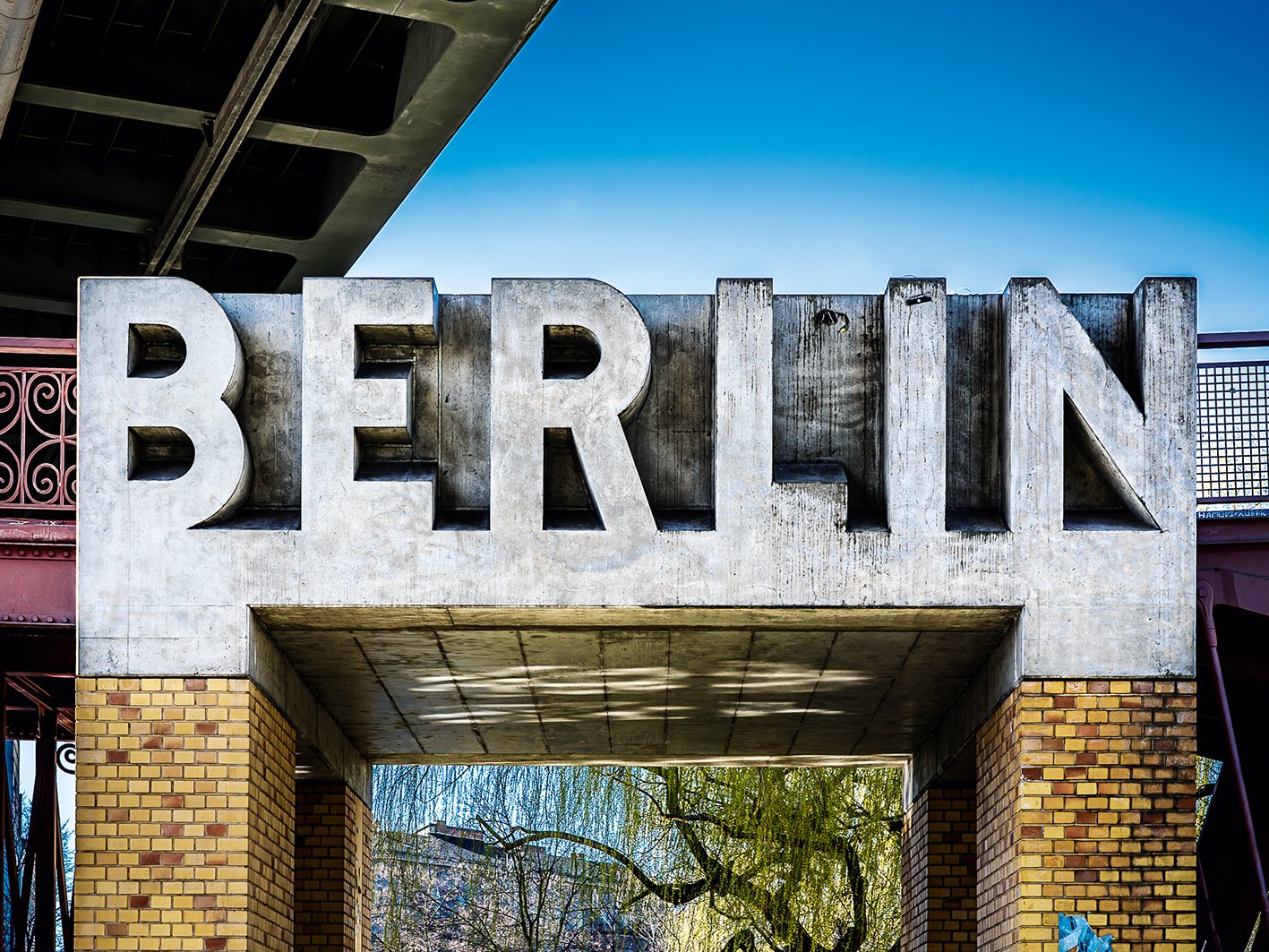
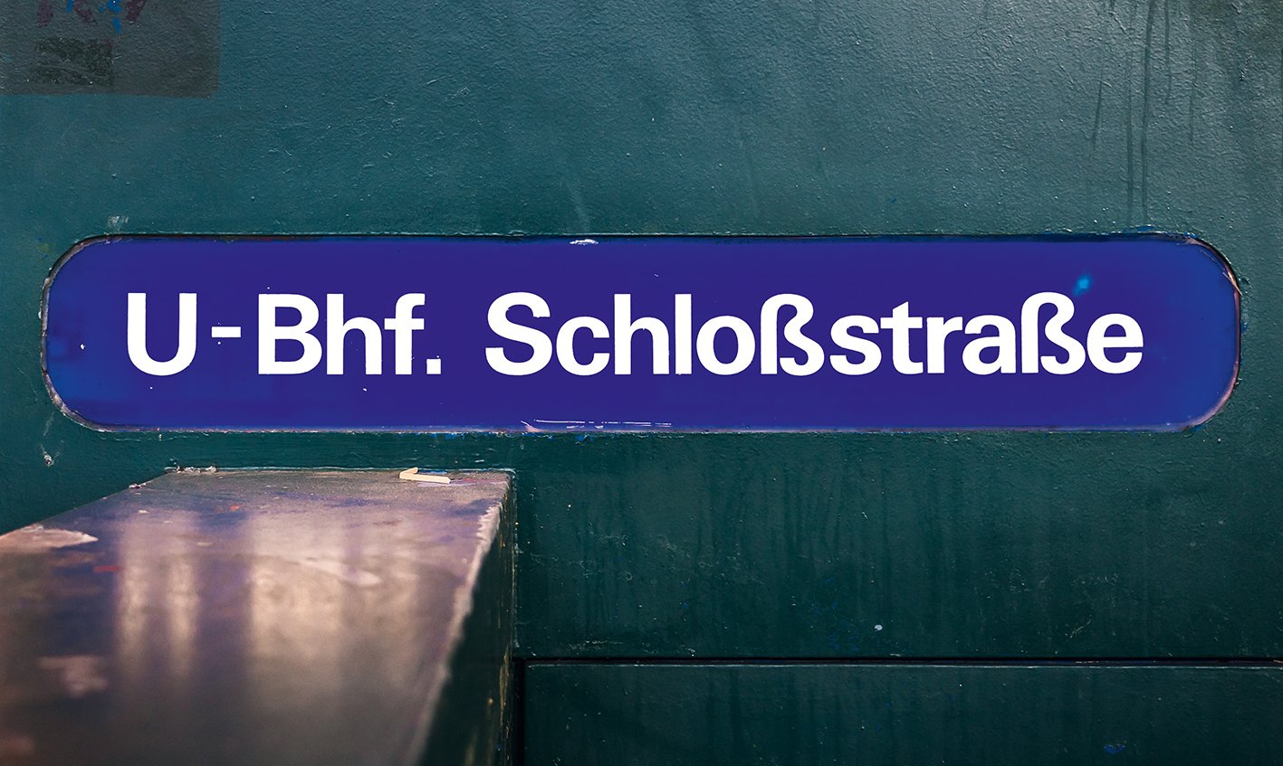
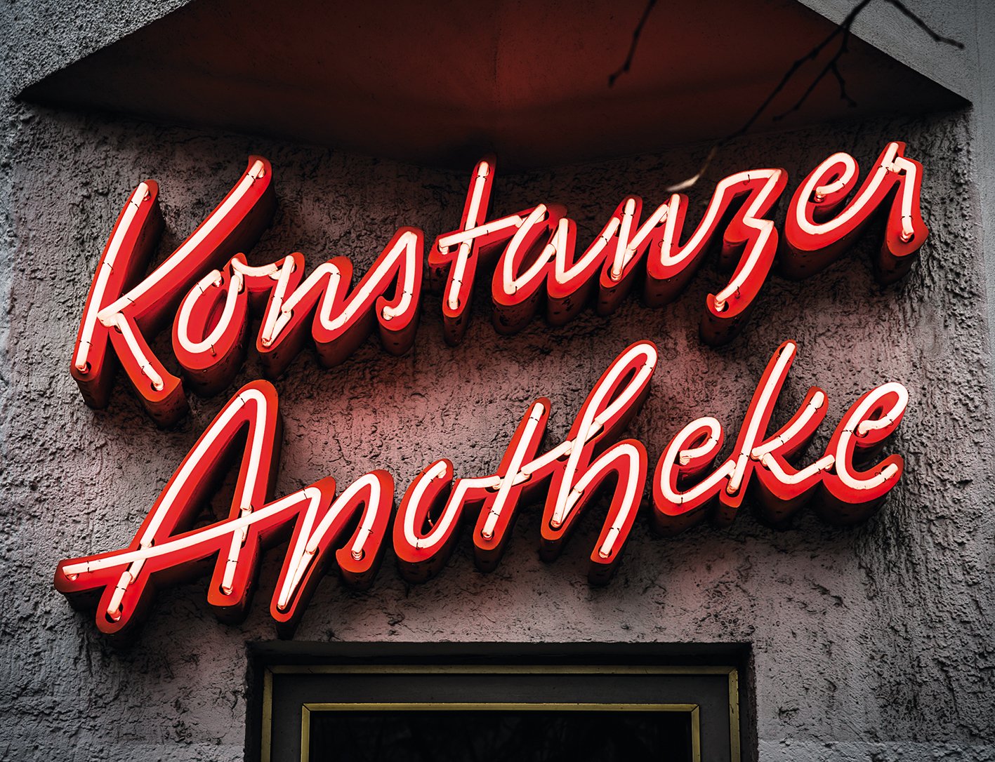
Now, the highlights of this incredible archive have been distilled into a photographic book: Berlin Typography Project, comprising more than 200 images of the city’s typographic heritage.
The volume is part personal collection and part preservation project: many of the signs featured have now disappeared – replaced or removed forever as redevelopment continues at pace.
Thanks then to enthusiasts like Jesse, who’s hard work ensures that the typographic history of the city is preserved – and can be enjoyed for generations to come. Surely, a good sign.